
VISUAL STANDARDS TO BEGIN WITH
Positioning a dual-context brand with surgical clarity. We codified Beartooth’s identity so it reads as credible to operators and compelling to consumers: one voice, tuned for multiple theaters.
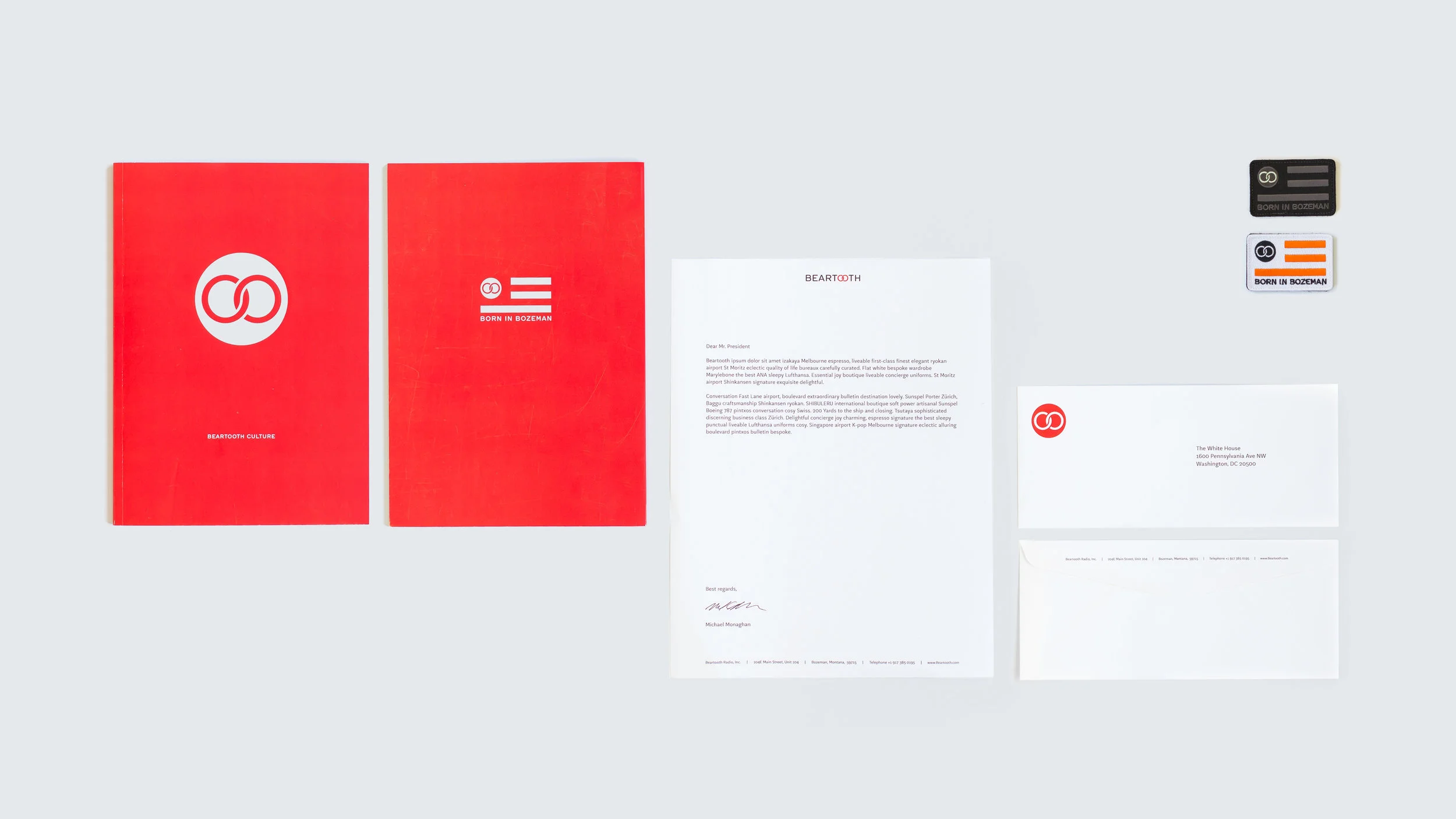
DESIGN AS DRIVER
Every detail carries load. The system translates mechanical rigor into visual language: refined, legible, and field-ready.
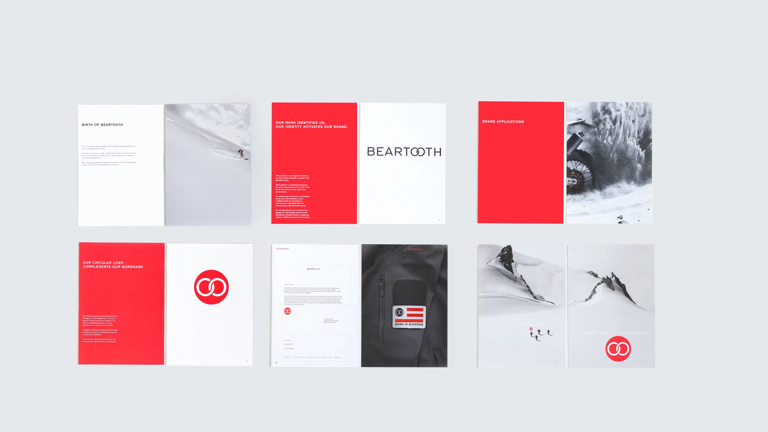
Core assets
The interlinked ‘OO’ wordmark embodies resilient connectivity. The circular seal deploys as a secondary mark when context is established.


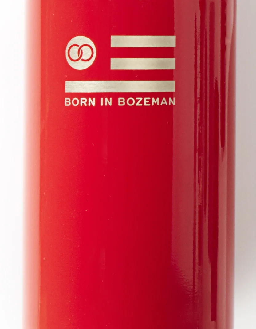
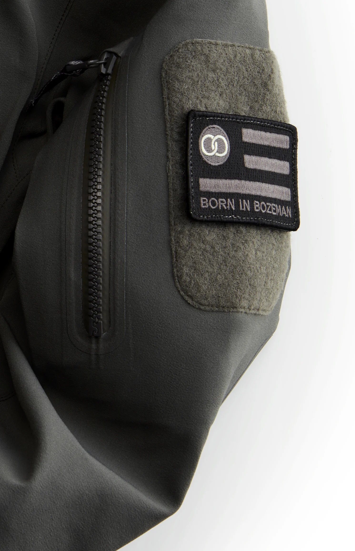
Activation
Only meaningful artifacts leave the studio: useful, durable, and aligned with the brand’s promise of unbroken communication.
SHIBULERU TEAM
Lukas Scherrer, Mike Ronkoske