
BRAND AND LOGO DESIGN FOR THE SAN FRANCISCO ZÜRICH SISTER CITY COMMITTEE
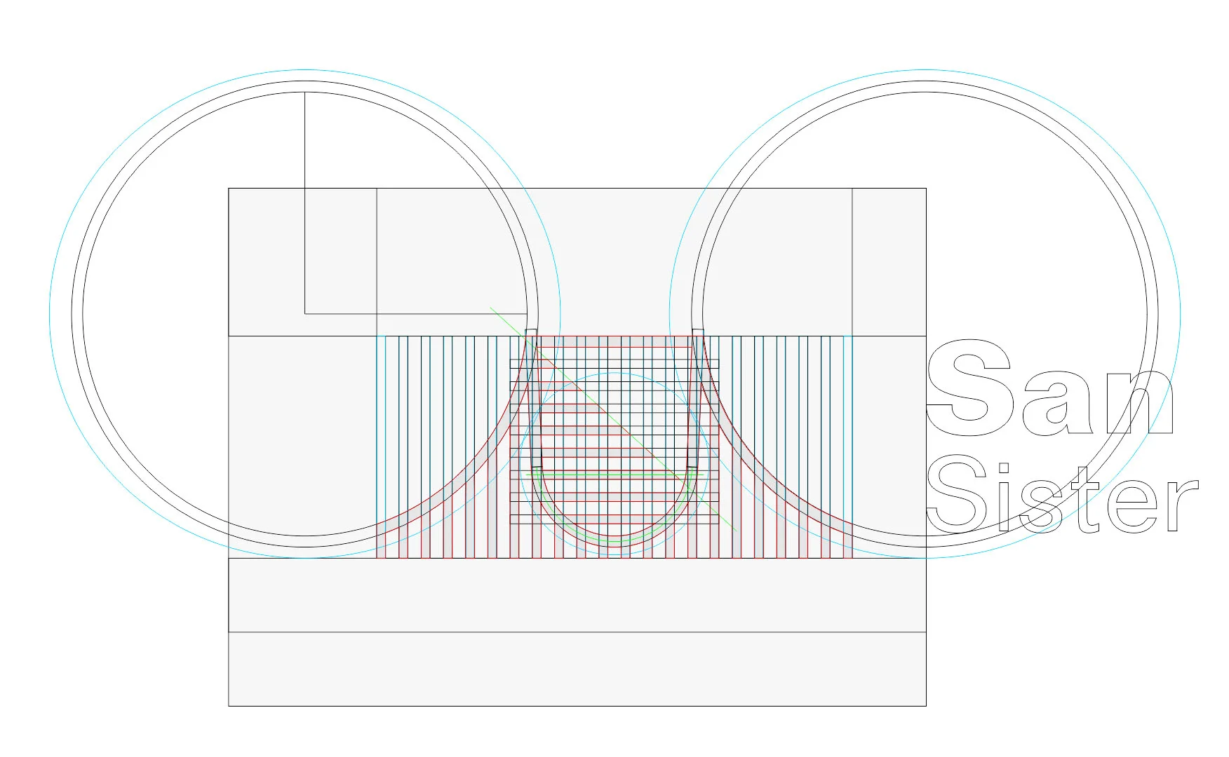
Two cities, one mark. We fused the Golden Gate Bridge with Zürich’s crest into a disciplined symbol built on a strict grid, where positive and negative space read with typographic clarity.
Designed to scale, the mark renders crisply from lapel pins to banners, print to screen. A concise standards system governs grid, spacing, and usage so civic partners can deploy the identity consistently across ceremonies, programs and everyday communications. Timeless form, modern utility.
SHIBULERU TEAM
Lukas Scherrer, Reto Spillmann