
VISUAL STANDARDS TO BEGIN WITH
Positioning a dual‑context brand with surgical clarity. We codified Beartooth’s identity so it reads as credible to operators and compelling to consumers—one voice, tuned for multiple theaters.
DESIGN AS DRIVER
Every detail carries load. The system translates mechanical rigor into visual language—refined, legible, and field‑ready.
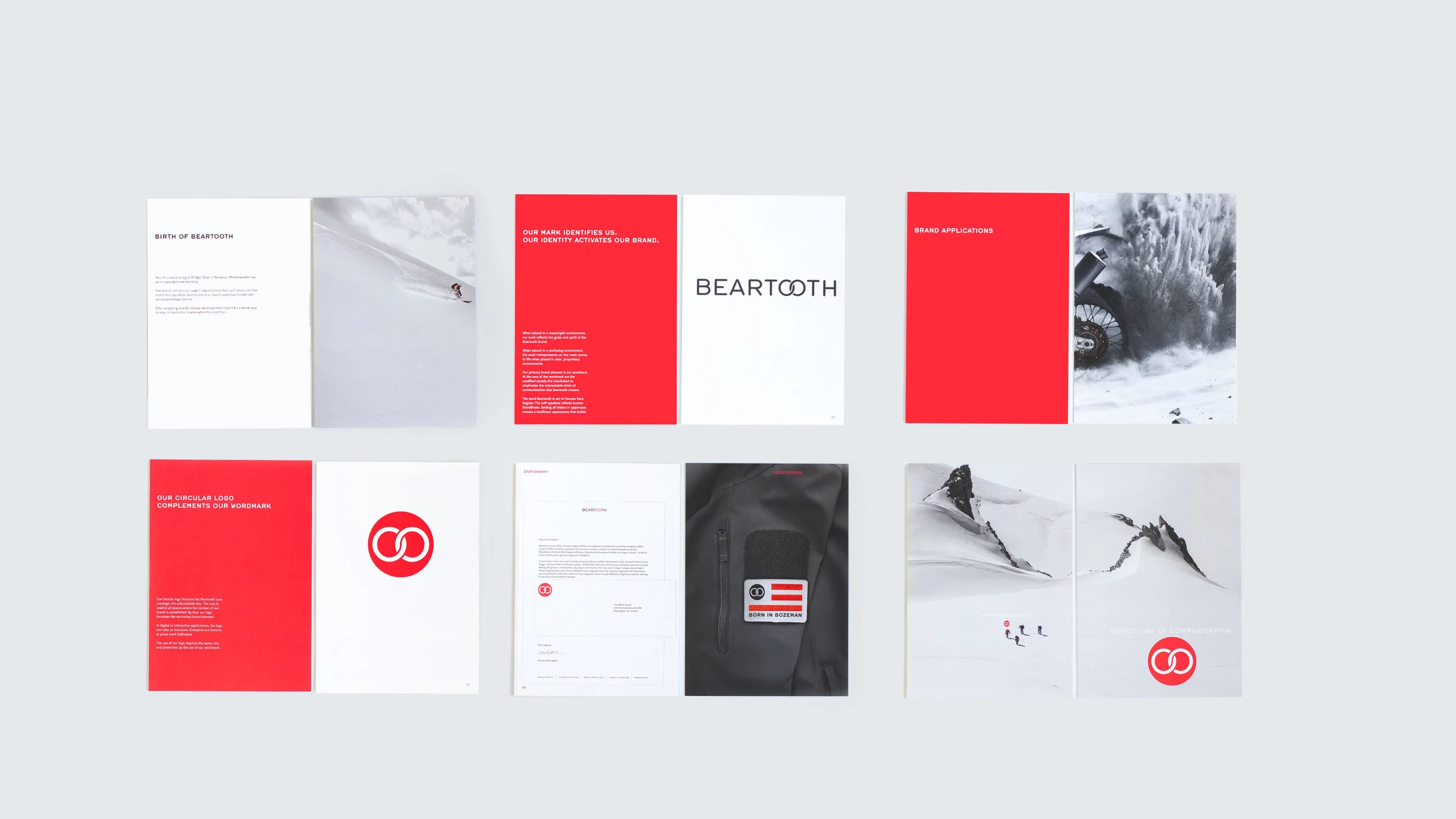
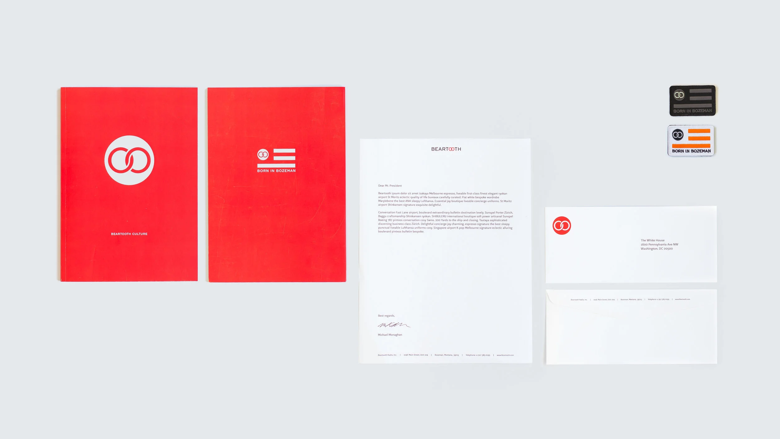
Core assets
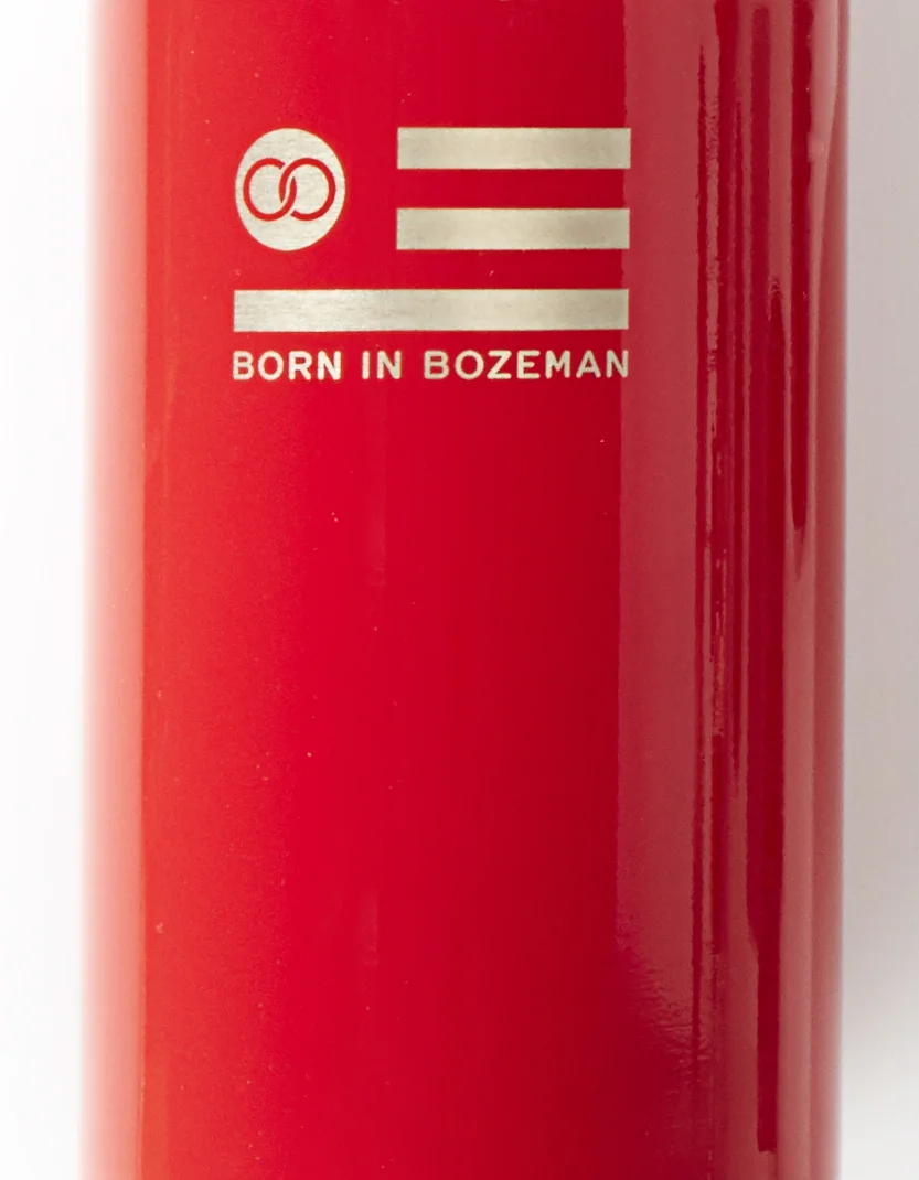
The interlinked ‘OO’ wordmark embodies resilient connectivity; the circular seal deploys as a secondary mark when context is established.


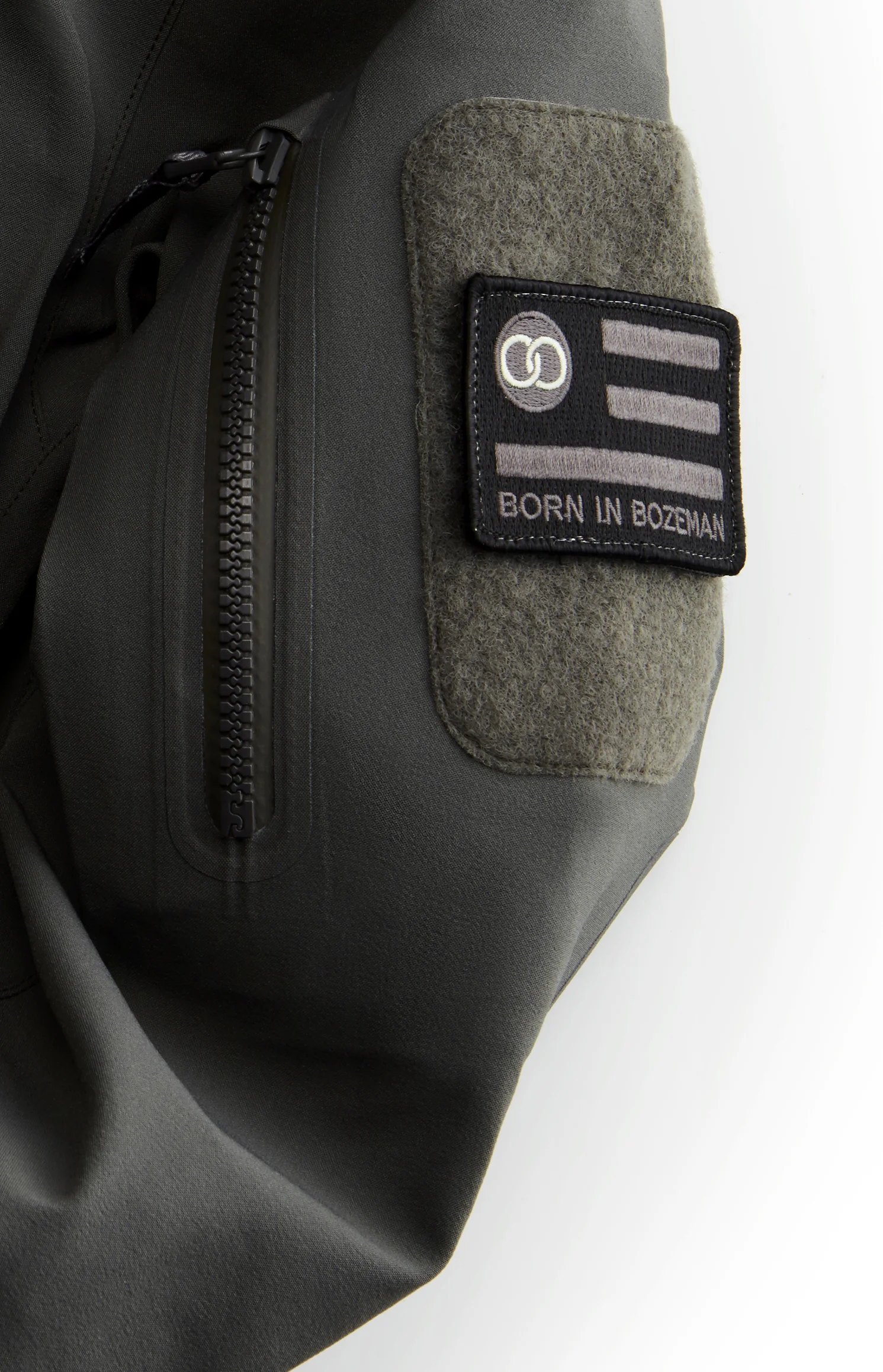
Activation
Only meaningful artifacts leave the studio—useful, durable, and aligned with the brand’s promise of unbroken communication.
SHIBULERU TEAM
Lukas Scherrer, Mike Ronkoske