
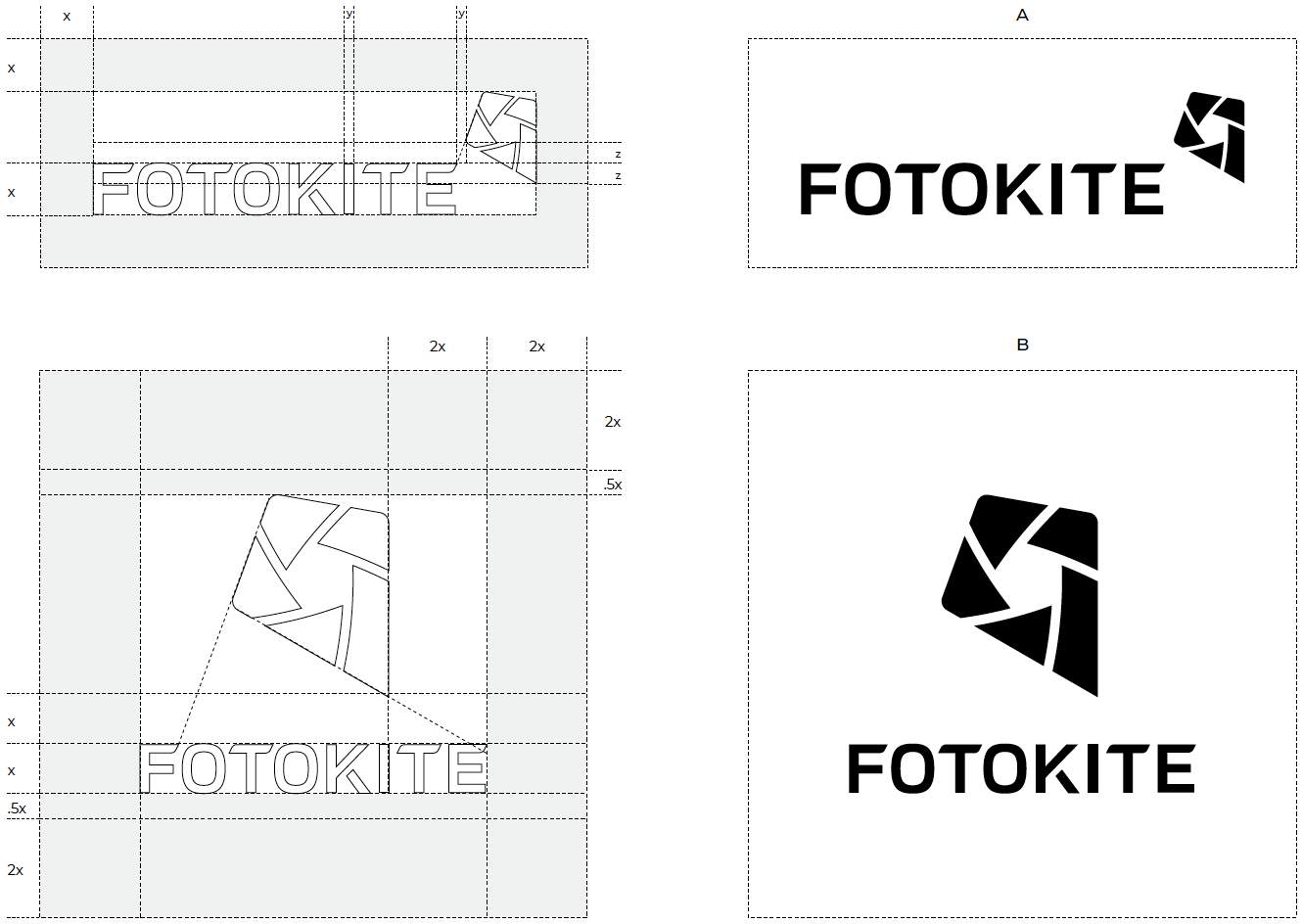
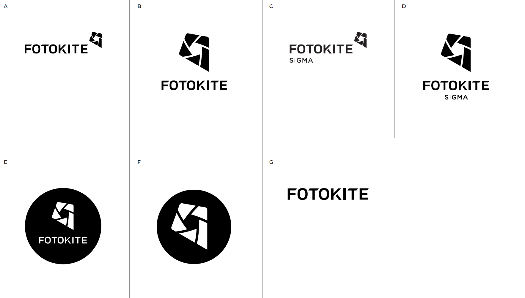
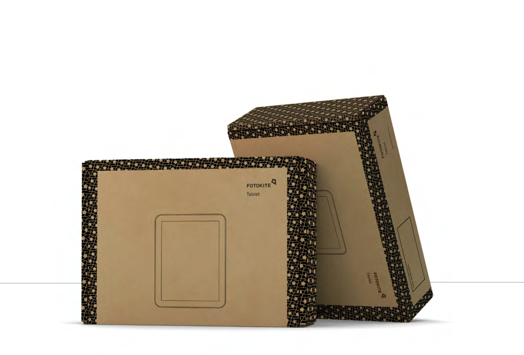
SETTING THE VISUAL COMMUNICATION STANDARDS
Clarity that scales. We built Fotokite’s brand to carry the weight of public safety—precise enough for engineers, legible enough for the field. A kite‑lens symbol captures uplift and observation; a purposeful logotype builds recognition without noise. The system flexes from product to patches, from livery to packaging, while a concise Brand Book protects consistency as the company grows. Identity designed to perform—on vehicles, on devices, in moments that matter.
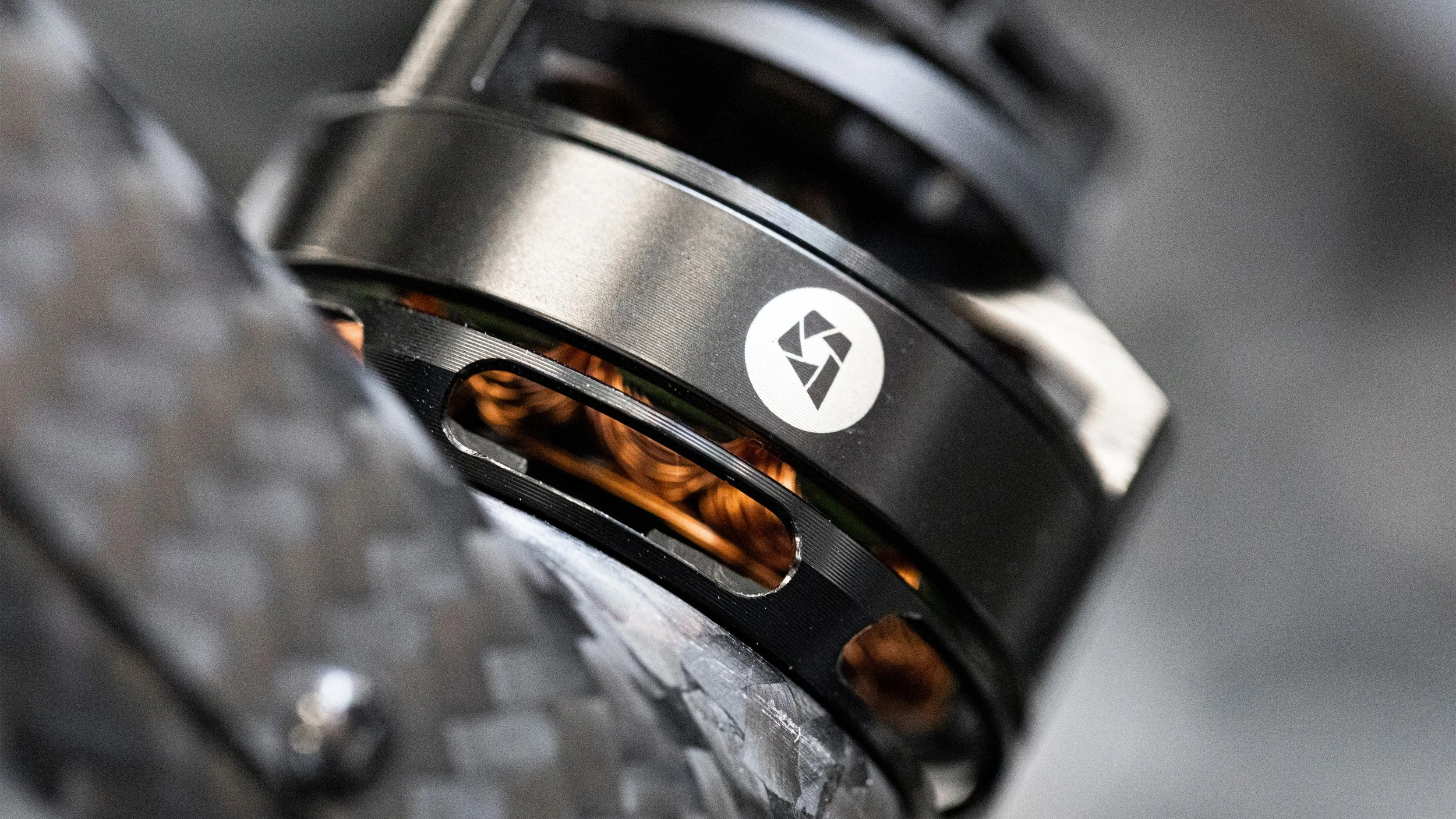
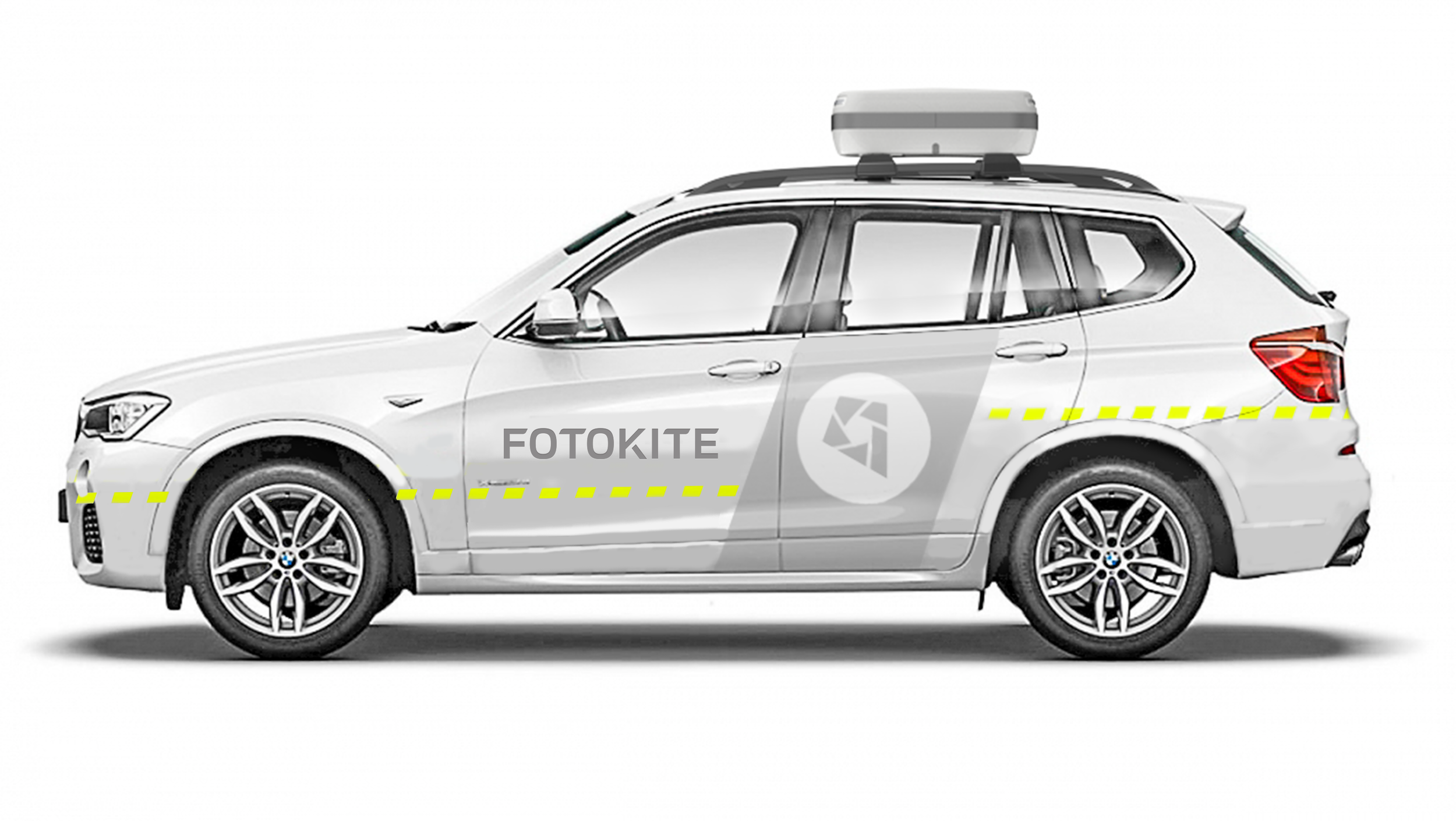
LIVERY
Strong visual branding can help create brand awareness every time we drive to a product demo, trade-show or event. Public safety is one of our product markets, and public safety materials, like fluorescent colors and reflective taping are designed to be seen. The branding concept shown uses these materials and finishes along with our visual assets to connect our brand to the public safety sector and to get the attention of potential customers.
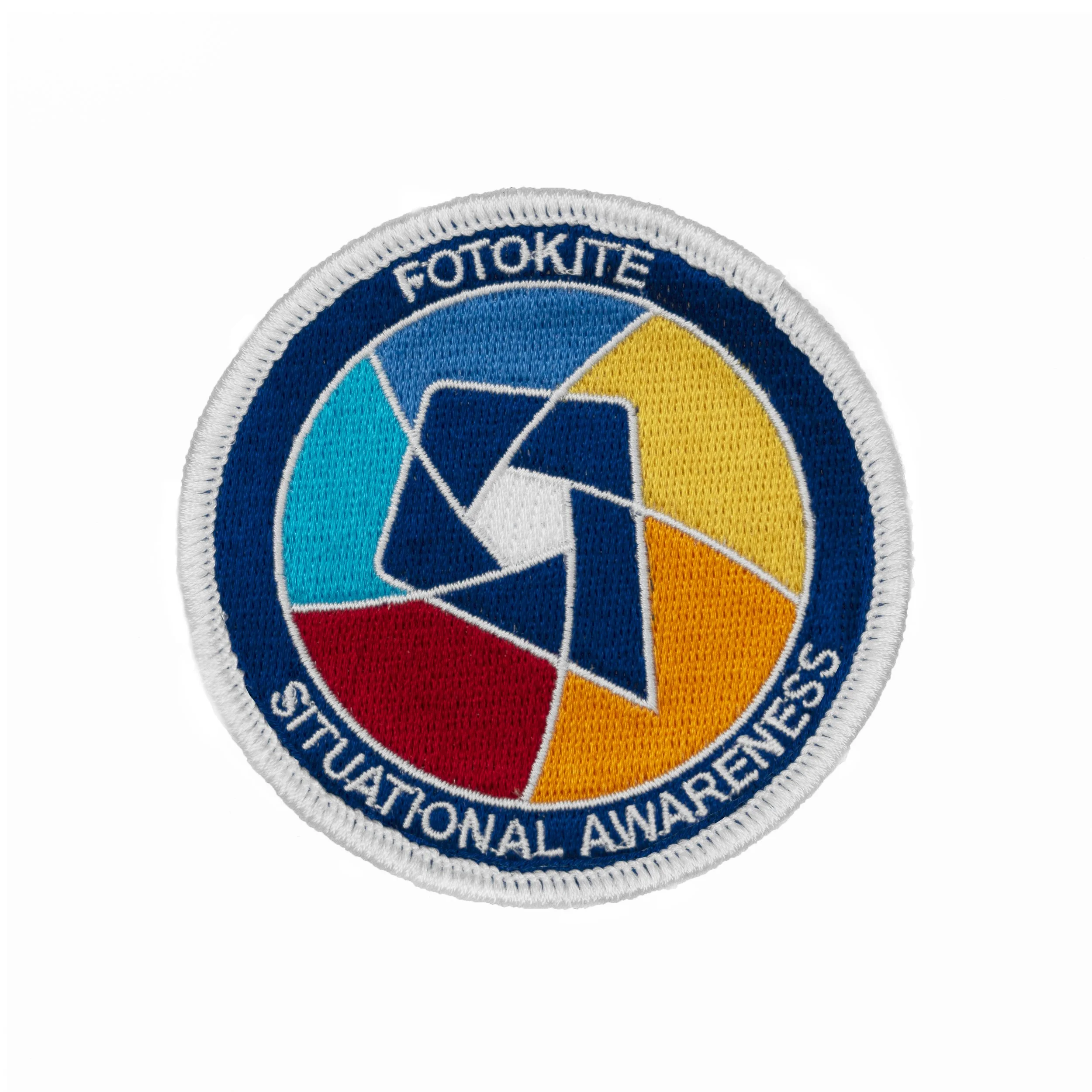
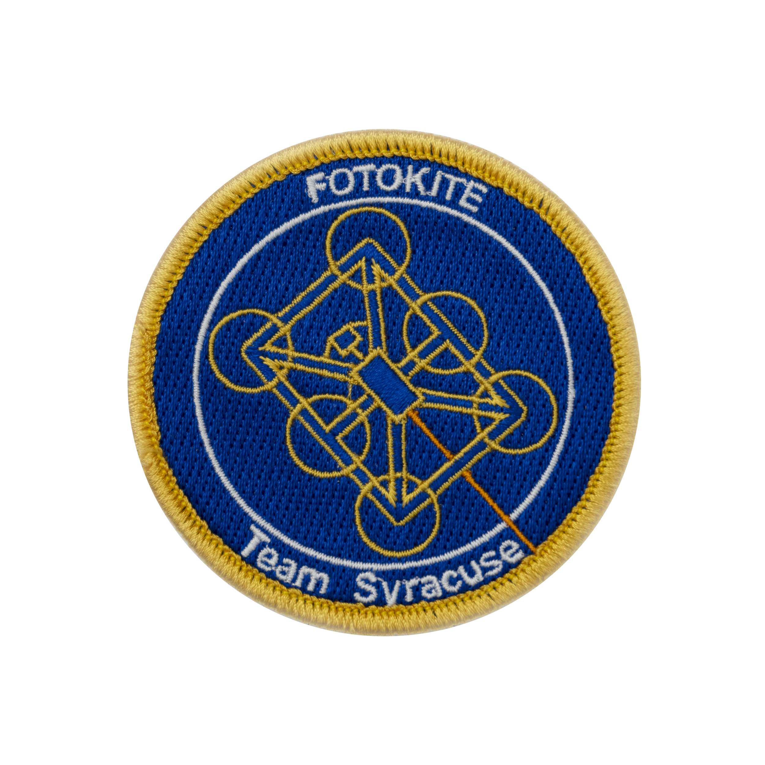
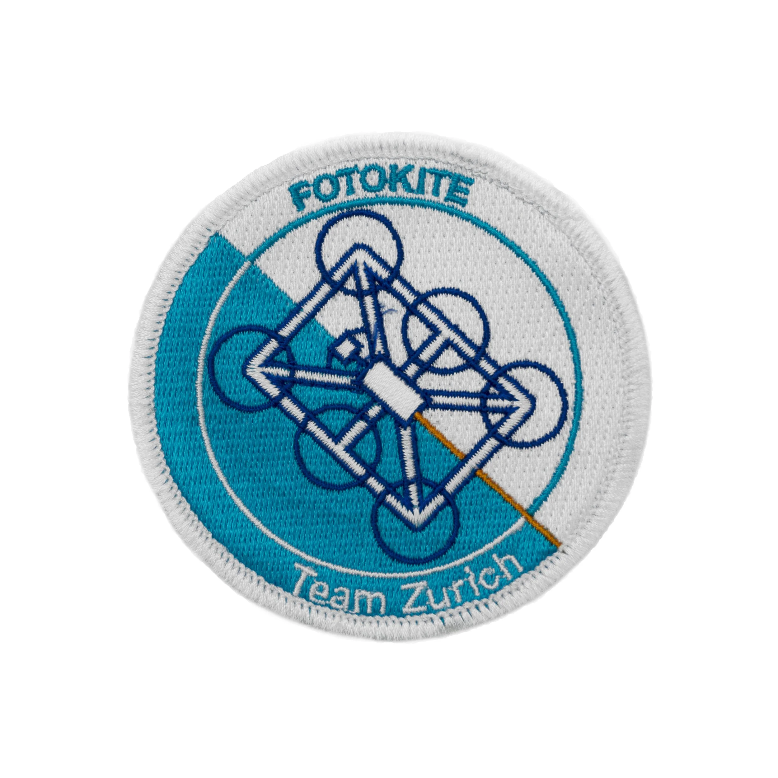
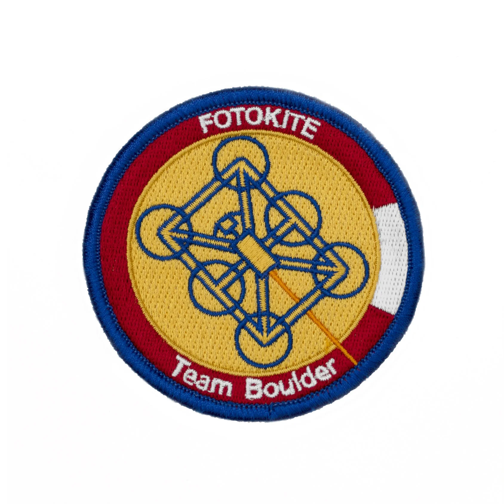
PATCHES
Global patches are meant to be shared with customers and distributors. Team patches are to be shared with Fotokite team members only and are exclusive to their location.
The inspiration for the Fotokite patches came from the Zürich, Colorado and New York flags and their colors, layouts and symbols.
SHIBULERU TEAM
Lukas Scherrer
FOTOKITE TEAM
Petra Bregar-Cerk, Lee Hendrickson, Andy Hodgson