
VISUAL IDENTITY FOR AN INFANT PRODUCT STARTUP
A brand that grows with the family. We built mimijumi’s identity to feel warm without whimsy: typographic charm with Swiss restraint, packaging engineered for DTC reality, and a mark that scales from feeding to future categories. Joy, disciplined.
APPROPRIATE LOGOMARK FOR FUTURE GROWTH
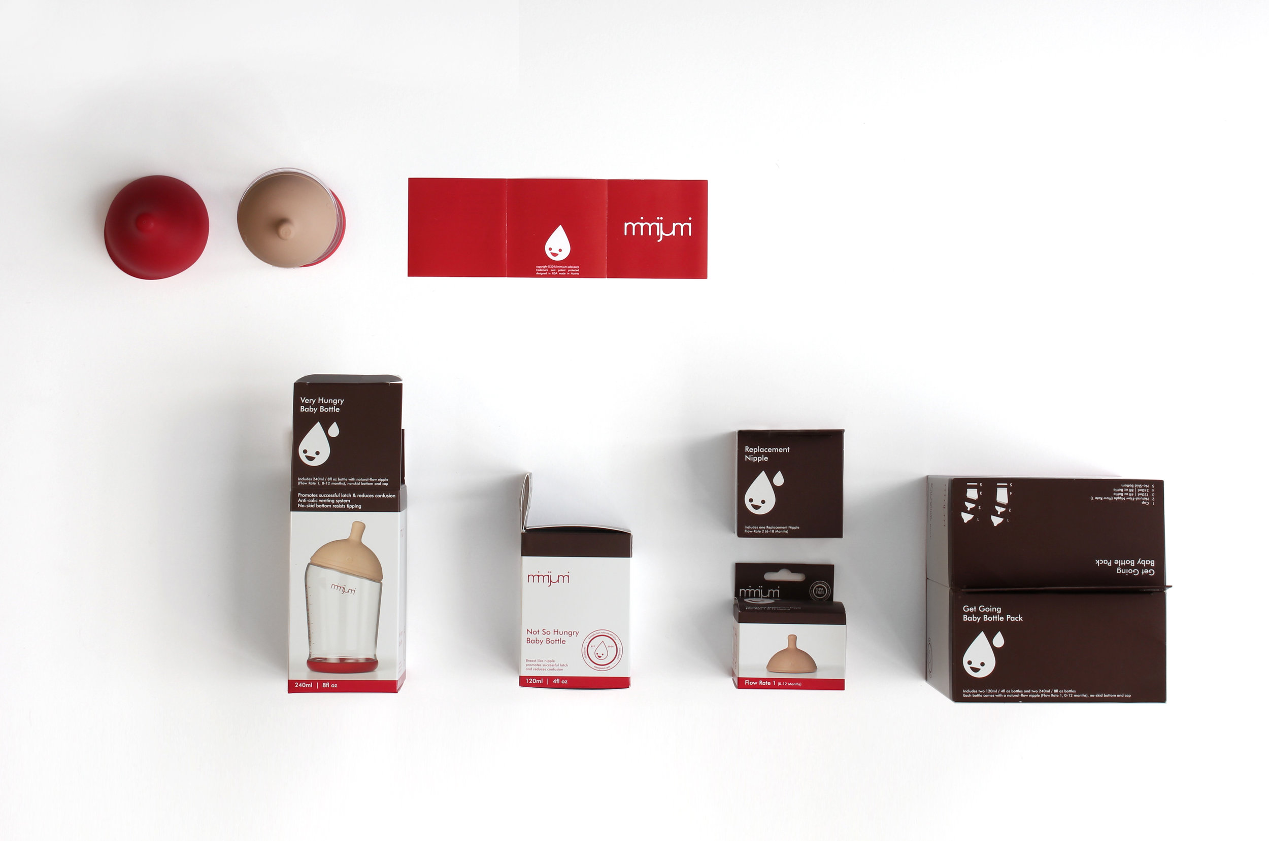
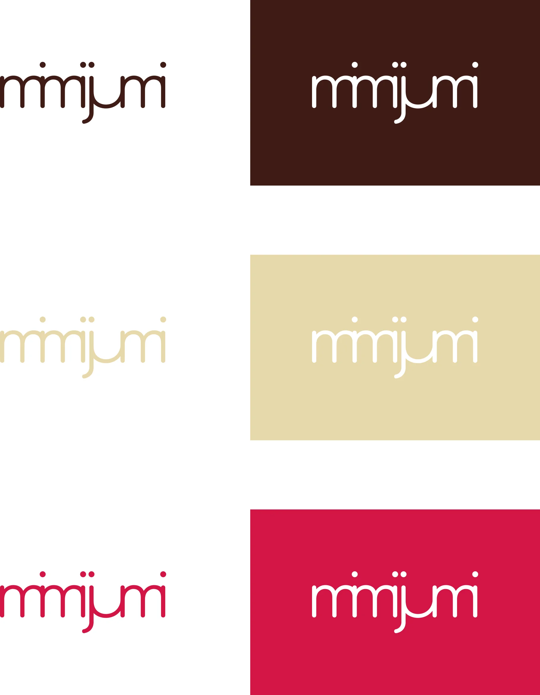
The mimijumi logomark refers to the joyful and emotional experience of parenthood. The dots of the i’s seem to jump happily over the mark which adds a hint of humor. The soft typeface reflects human friendliness while the merged letters play up the notion of refinement with a quirky twist. The footprint of the trademark is compact while still light in appearance. It works in positive space as well as negative and as outlines only. The design was chosen to become a platform for any kind of infant product starting with feeding then growing into other markets such as cleaning, apparel and more.


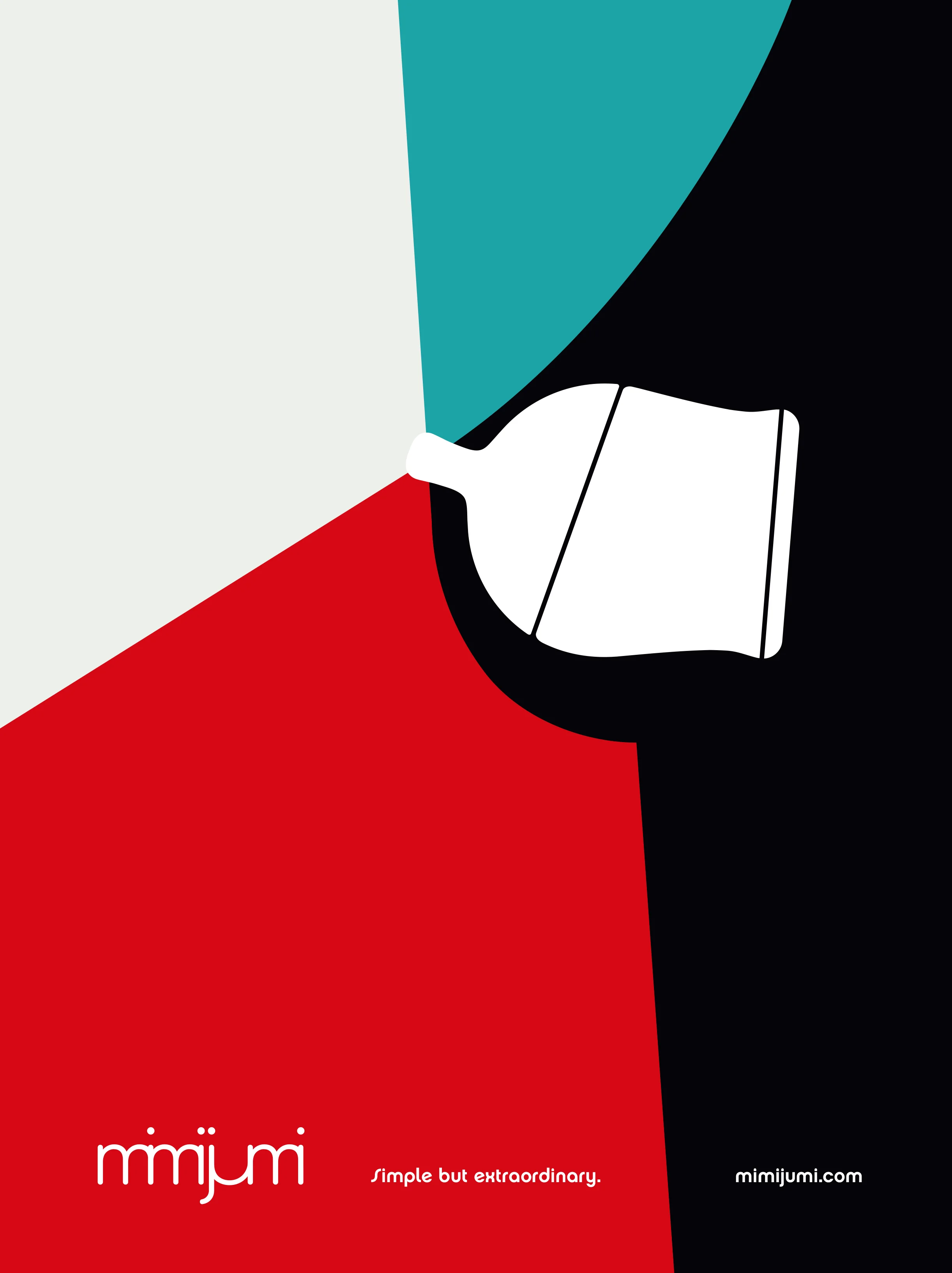
CAMPAIGN DESIGN
The mimijumi brand campaign is built on Swiss graphic design from the 60s and 70s without being retro. mimijumi creates its very own visual appearance that looks shockingly quiet yet refined.
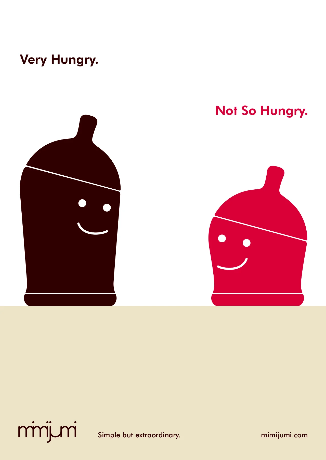
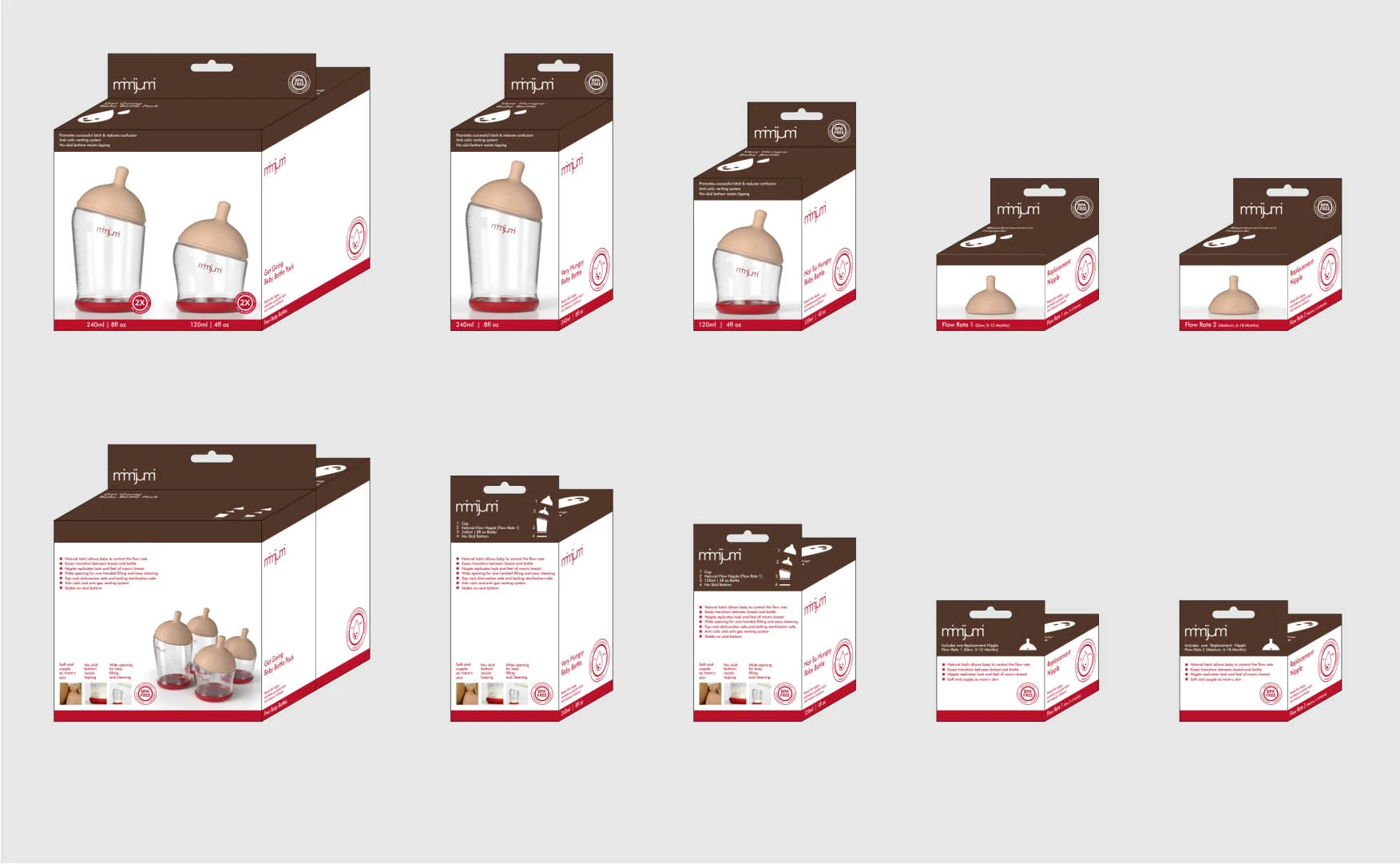
SECONDARY ASSETS
We avoided well trodden children imagery every other infant related brand uses. instead, we built on the clean lines and quality of the product and designed every touchpoint with humor and craft.
SHIBULERU TEAM
Lukas Scherrer, Maria Pitallano, Mike Hester