

VISUAL STANDARDS TO BEGIN WITH
Beartooth lives in both consumer and military worlds. We distilled down these opposing contexts as well as the founders' vision into a brand that positions Beartooth appropriately. We designed everything from brand strategy to tangible assets such as logomark, wordmark and brand guidelines for our clients’ everyday use.

DESIGN AS DRIVER
Precision is a part of the Beartooth DNA. This includes the design, engineering, manufacturing, even a printed piece of collateral - every detail serves a purpose. The same consideration and craft of analog design processes are translated into the digital world. By that, we create a very own visual appearance that looks shockingly refined yet rugged.

VISUAL SYSTEM
The visual system we designed lets beartooth adapt to various contexts like consumer facing, athlete facing and military facing with consistency. The tone is the same while the language is different to capture the audience appropriately.
Wordmark
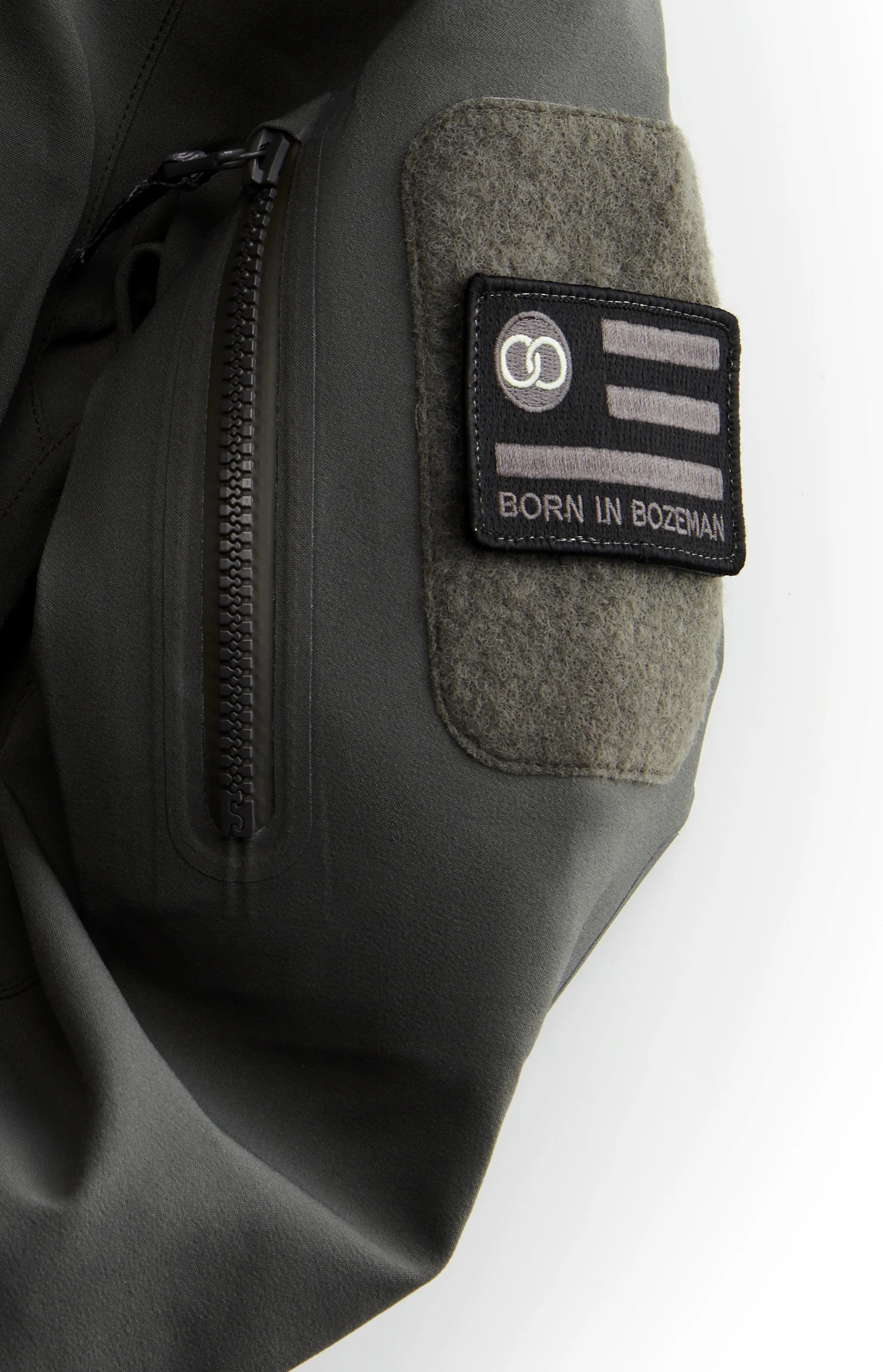
The primary Beartooth brand element is the wordmark. At the core of the wordmark are the modified double O’s; interlinked to emphasize the unbreakable chain of communication that Beartooth creates.
Logo Mark
The circular logo features the Beartooth core message, the unbreakable link. The icon is used in all places where the context of the brand is established. By that, the logo becomes the secondary brand element.


ACTIVATING THE BRAND IN A MEANINGFUL WAY
What we give to the people that matter most defines beartooth as much as their products. We defined to only give away well considered, valuable items that we carry ourselves day by day. The quality, brand and message of give-aways need to reflect the beartooth values so they are worthy of carrying the beartooth wordmark or logo.

SHIBULERU TEAM
Lukas Scherrer, Mike Ronkoske