

SETTING THE VISUAL COMMUNICATION STANDARDS
Fotokite designs and deploys advanced situational awareness technology to support public safety professionals in the protection of and in service to communities across the globe. Headquartered in Switzerland, Fotokite provides an accessible and accountable system to capture aerial perspectives that serve the public through our customers, from firefighting to emergency management and police.
In its scale-up stage, the company needed a solid fundament for the brand to grow.
THE SYMBOL
The Fotokite symbol combines the silhouette of a kite with the iris blades of a lens. The sharp corners and straight outlines of the kite reference the precision of our products. The rounded shoulders of the kite compliment the precise angularity, and reference the approachable, user-friendly aspects of our products.
THE LOGOTYPE
The word FOTOKITE is crafted from uppercase letters. The F, T’s and E feature rounded corners resembling propellers - The mechanical element that propels our product into the sky. The outline of the K is broken to further emphasise the uplift and to visually break the word Foto and Kite.


VISUAL SYSTEM
The visual system we designed lets Fotokite adapt to various contexts. These selected configurations allow for appropriate branding across a wide variety of contexts including print, digital and physical product. The following pages describe the main uses of the trademark versions.


COMMUNICATING THE BRAND TO THE COMPANY
The Brand Book describes the brand assets of Fotokite and guides the users of it through the various brand related items and how they are used properly.
It is a crucial reference document in a growing organization to maintain visual consistency.
ACTIVATING THE BRAND
LIVERY
Strong visual branding can help create brand awareness every time we drive to a product demo, trade-show or event. Public safety is one of our product markets, and public safety materials, like fluorescent colors and reflective taping are designed to be seen. The branding concept shown uses these materials and finishes along with our visual assets to connect our brand to the public safety sector and to get the attention of potential customers.

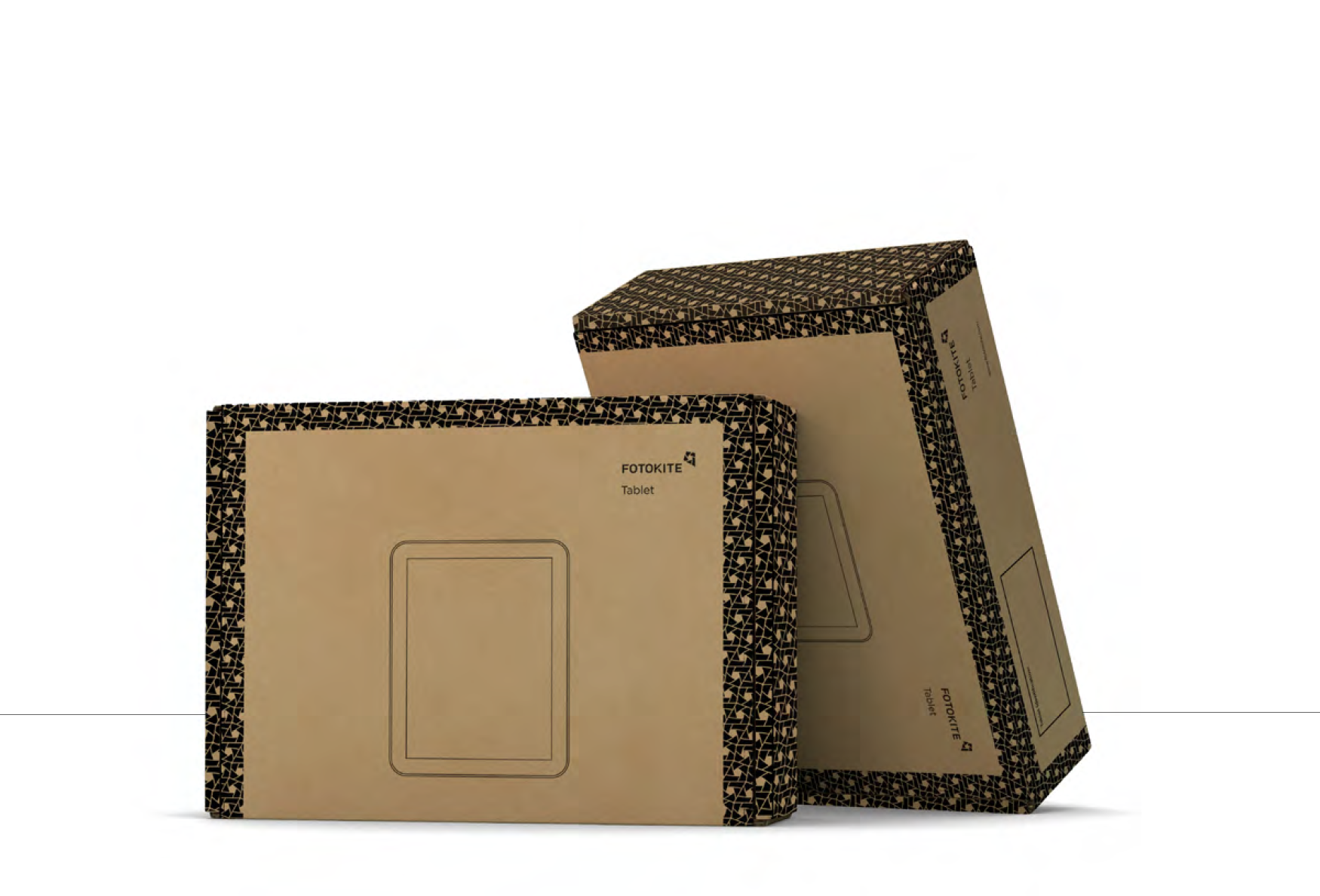
PACKAGING
Using patterns in the packaging design helps Fotokite to maintain a consistent connection with the brand and to visually differentiate their products.
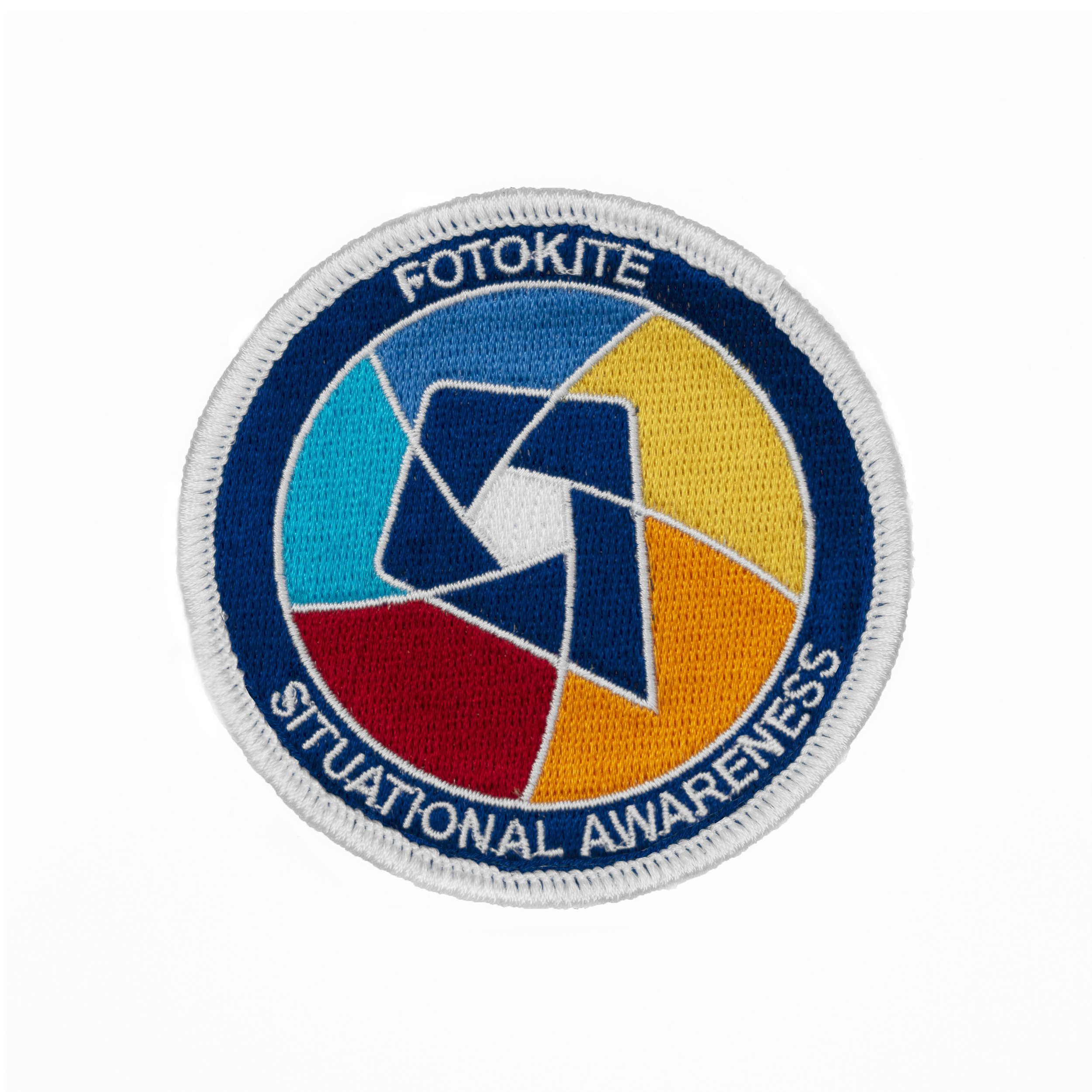
PATCHES
Global patches are meant to be shared with customers and distributors. Team patches are to be shared with Fotokite team members only and are exclusive to their location.
The inspiration for the Fotokite patches came from the Zürich, Colorado and New York flags and their colors, layouts and symbols.


SHIBULERU TEAM
Lukas Scherrer
FOTOKITE TEAM
Petra Bregar-Cerk, Lee Hendrickson, Andy Hodgson