BRAND AND LOGO DESIGN FOR THE SAN FRANCISCO ZÜRICH SISTER CITY COMMITTEE
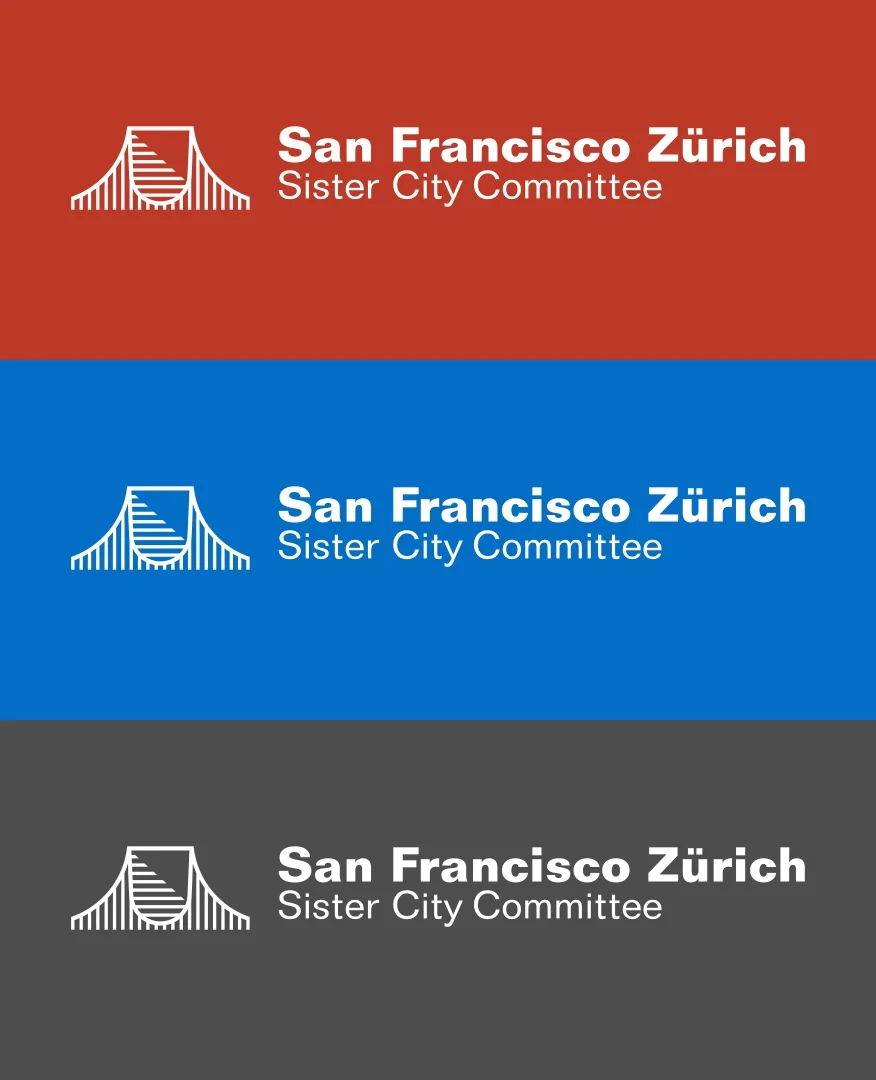
We designed the logomark and brand standards for the San Francisco Zürich sister city committee. In the development phase we looked at an elegant way of combining the crest of Zürich with the iconic golden gate bridge. Based on a strict grid, the logomark falls in place naturally. Positive and negative space is addressed in a typographic manner.
The new logomark combines the Golden Gate Bridge and the crest of Zürich in a timeless way.
ICONIC COLORS
To highlight the connection between the two cities San Francisco and Zürich, we chose the colors most linked to the respective city. The idea was that each cities committee will use their Assigned color. For joint communication, the grey is used.
San Francisco: Pantone 180, International Orange
Zürich: Pantone 300, Zürich Blue
Both: 70% Grey, Zürich Winter, San Francisco Summer
LONG LASTING RELATIONSHIP
For the tenth anniversary of the sister city committee we designed a special logo. we incorporated the logomark into the number one of a ten. The 10th Anniversary logo was used for give-aways during the renewal ceremony of the memorandum of understanding, signed by the mayors of san francisco and Zürich.
SHIBULERU TEAM
Lukas Scherrer, Reto Spillmann


